
Select a course and establish context#
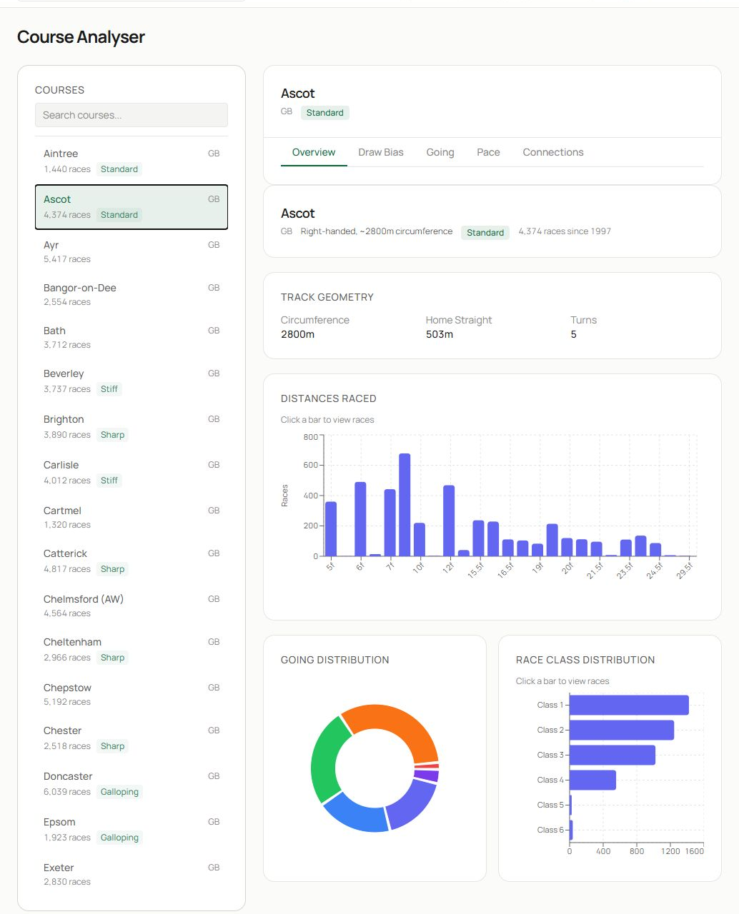
- Search the course list or scroll to a course, then select it.
- The selected course card shows country, handedness, approximate circumference, surface and the number of races in the dataset. Use the tabs to move between Overview, Draw Bias, Going, Pace and Connections.
- Overview summarises track geometry, distances raced, going distribution and race-class distribution. Use these charts to understand the sample before interpreting a narrower pattern.
The filters on analysis tabs let you limit distance, field size, date period and going. A tighter filter produces a more relevant sample, but it also reduces confidence. The page displays the number of races or runners analysed so you can judge that trade-off.
Analyse draw bias#
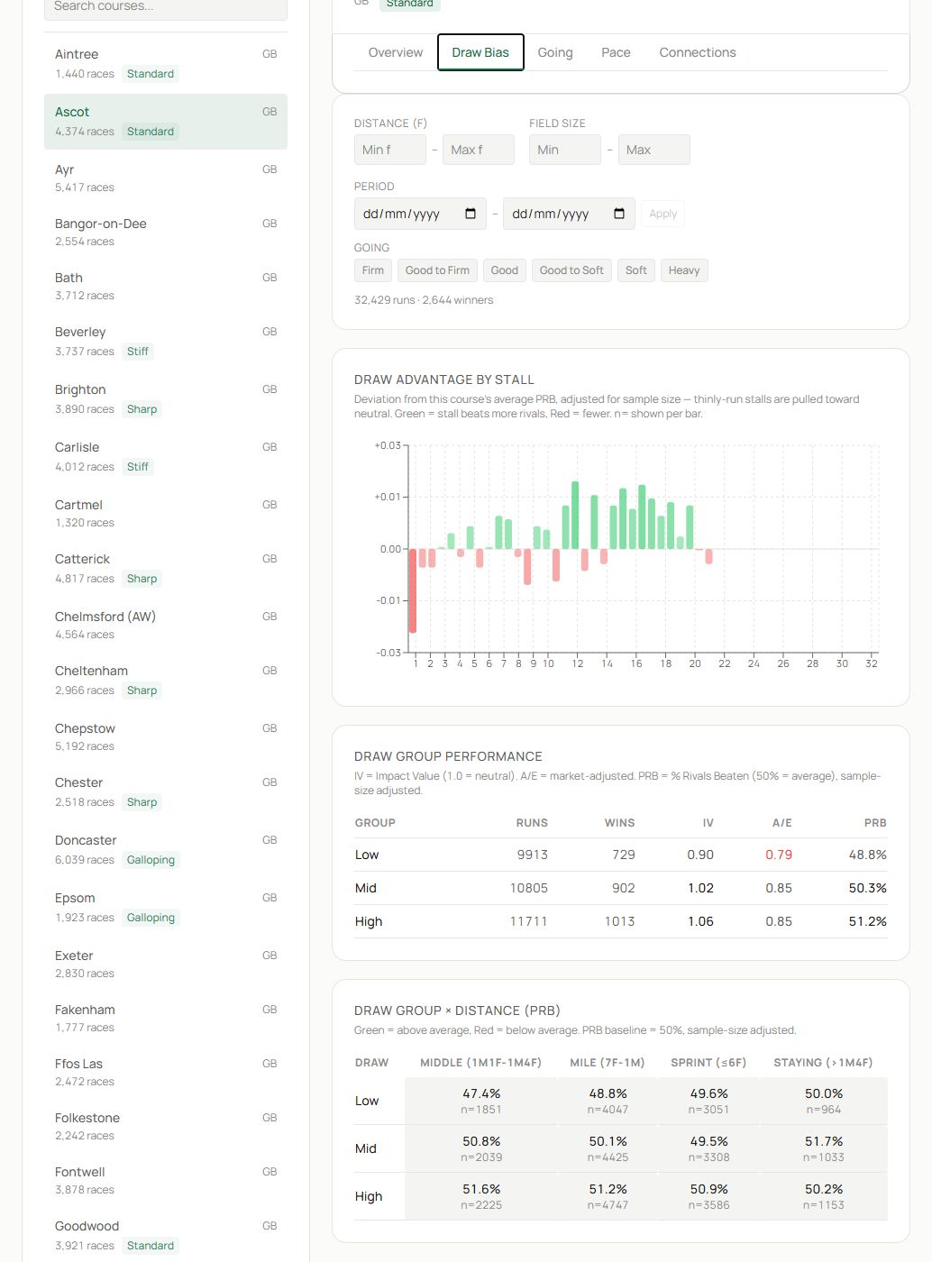
- Select Draw Bias and set distance, field size, period and going filters.
- Draw advantage by stall compares each stall with a neutral expectation. Green bars indicate a favourable result in the selected sample; red bars indicate an unfavourable result.
- Group tables compare low, middle and high draws using runs, wins, impact value, A/E and PRB. The distance matrix helps show whether the group effect changes by trip.
PRB, or percentage of rivals beaten, uses every finishing position and is often steadier than win rate. Above 50% means the group beat more rivals than average in that sample.
Analyse going#
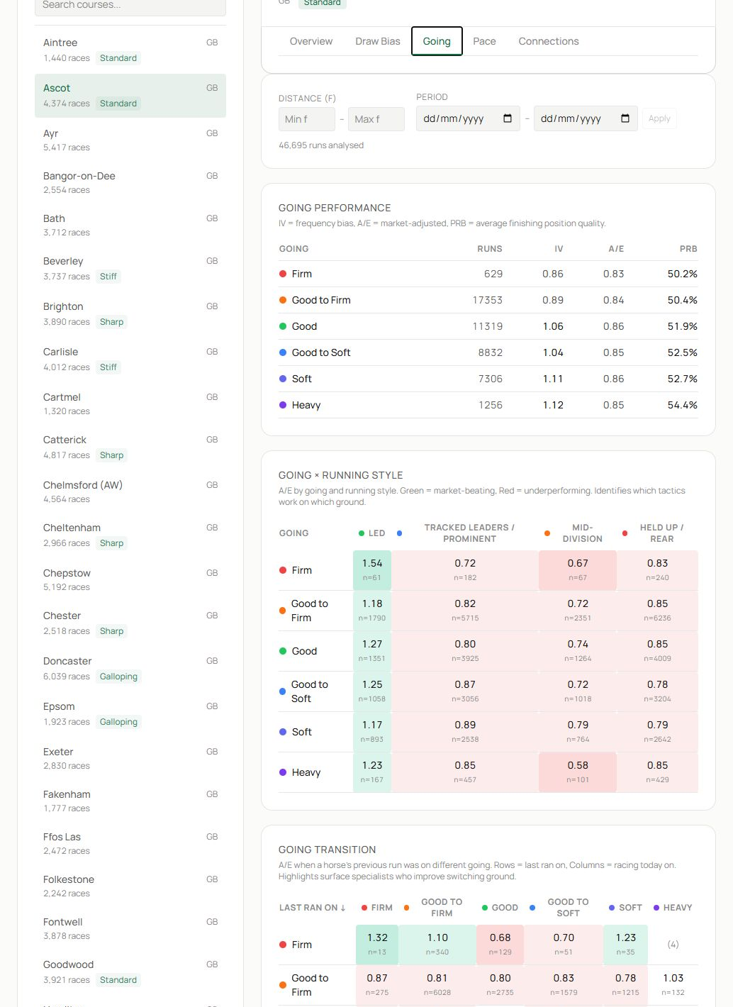
- Choose Going and set the scope.
- The performance table compares runners, impact value, A/E and PRB across going descriptions.
- The running-style and transition panels show how tactics perform on each going and how runners fare when today’s surface differs from their previous run.
Going categories can contain very different sample sizes. Treat a strong cell with few runners as a lead for further research.
Analyse pace#
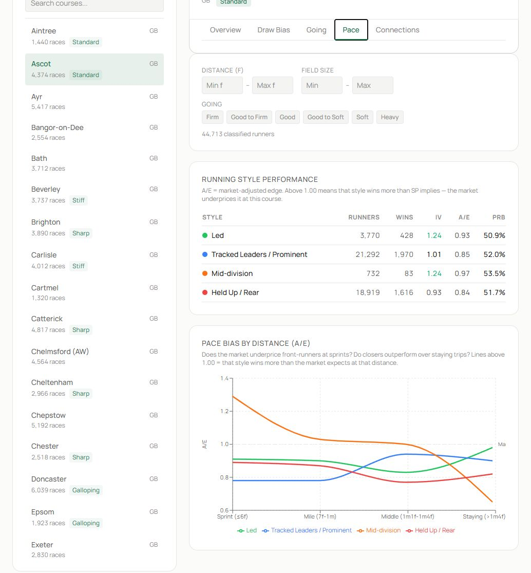
- Select Pace and apply the relevant filters.
- Compare led, prominent, mid-division and held-up or rear styles. A/E above 1.00 indicates market outperformance in the sample.
- Use the distance chart to see whether the advantage changes from sprint to staying trips.
Pace is a field interaction. A course may favour leaders historically, but a race containing several likely leaders can create a different shape.
Analyse trainers and jockeys at the course#
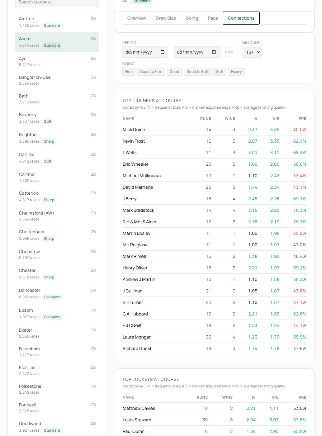
- Choose Connections, then set period, minimum runs and going.
- The trainer table ranks course performance with runs, wins, impact value, A/E and PRB.
- Continue to the jockey table and compare the same measures.
Increase the minimum-runs threshold when you want a more stable leaderboard. Lower it when looking for emerging patterns, but verify those names on their profile pages.
A complete course study#
- Read Overview to understand the course sample.
- Match distance, field size and going to the target race.
- Check draw groups and individual stalls.
- Review the pace profile and likely race shape.
- Inspect course-specific trainers and jockeys.
- Return to the racecard and combine the course evidence with runner ability and market price.
Related guides#
Use Today’s Card to apply the analysis to a live race and Systems Builder to test a course pattern across historical runners.